Introducing the Paysera POS logo and the story it tells!


First, a bit of history
A logo tells a story. Just in a different way. Instead of words and sounds, it sums it all up with a few brush strokes. Before we tell you about the Paysera POS logo, let's explore the broader evolution of Paysera's visual identity.
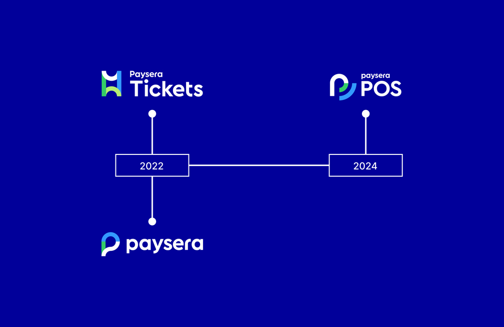
It all started back in 2022, when Paysera changed its entire visual identity, from its colour palette to the logo. This rebranding was deeply influenced by our clients' perceptions of Paysera, and it resulted in a fresh, cohesive look that embodies our core values: experience, innovation, and sustainability.
Later that same year, we extended this new branding to Paysera Tickets, one of our distinctive products. Although we created a separate logo for Paysera Tickets, we ensured it remained harmoniously aligned with the overall brand identity. We also introduced white and a vibrant green accent exclusively for Paysera Tickets to reflect the diverse events showcased on our platform.
Finally, fast-forward to 2024, and Paysera has introduced another innovative product – the Paysera POS virtual cash register for physical retailers. Recognising its uniqueness, we decided it deserved its own logo, marking the latest chapter in our ongoing visual development.
Let’s talk about the colours
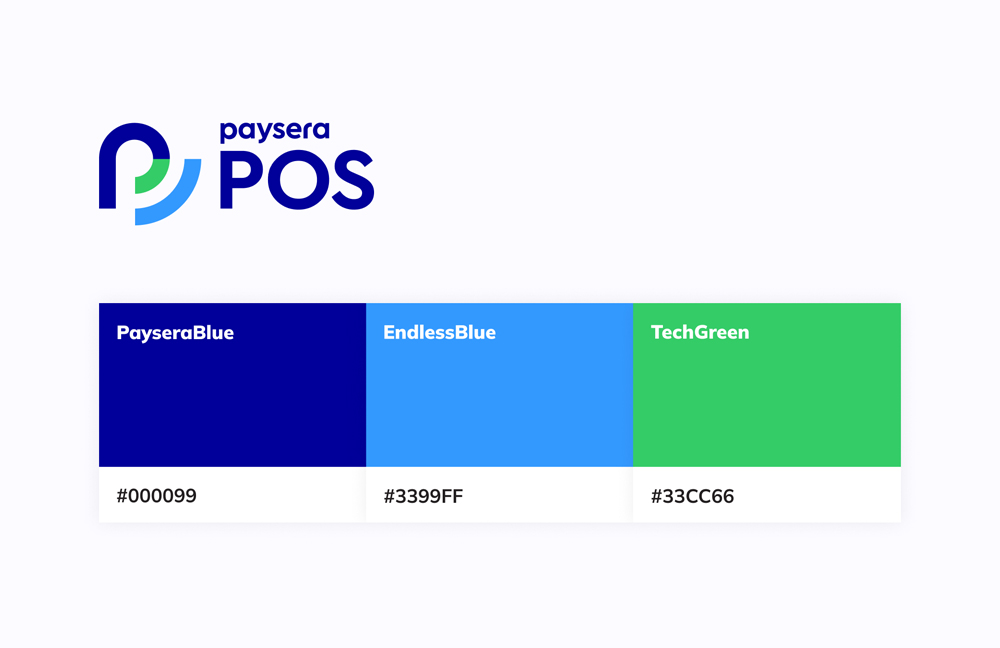
We want our products to be recognised as Paysera products, and consistency with colours is one way to ensure this. This is why Paysera POS was designed using our beloved PayseraBlue, EndlessBlue, and TechGreen colours – the same colours we use in our overall branding.
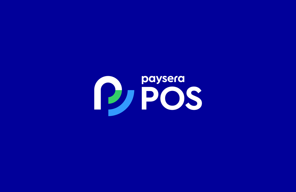
What does the Paysera POS logo mean and represent?
The letter "P" in Paysera branding serves a dual purpose: it represents a chat bubble, emphasising our dedication to open communication with clients, and a location pin, reflecting our global and local presence.
For Paysera POS, we used the same “P” symbol, added an extra line, and rearranged the colours to represent a wireless connection. This design choice highlights our commitment to providing a virtual, user-friendly, and efficient solution for physical retailers to manage payments. Also, it hints at our future plans for Paysera POS – but we’ll talk more about this another time!
Interested in Paysera POS?
We're excited to share everything about it with you! If you want to dive into the details of what Paysera POS is, we've got you covered in our previous blog post. For those who are ready to get started but still have questions about the process and features, we have a comprehensive guide on how to use Paysera POS.
If you're ready to take the next step or have any other inquiries, don't hesitate to reach out to our client support team. We're here to help you every step of the way!